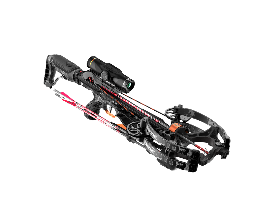
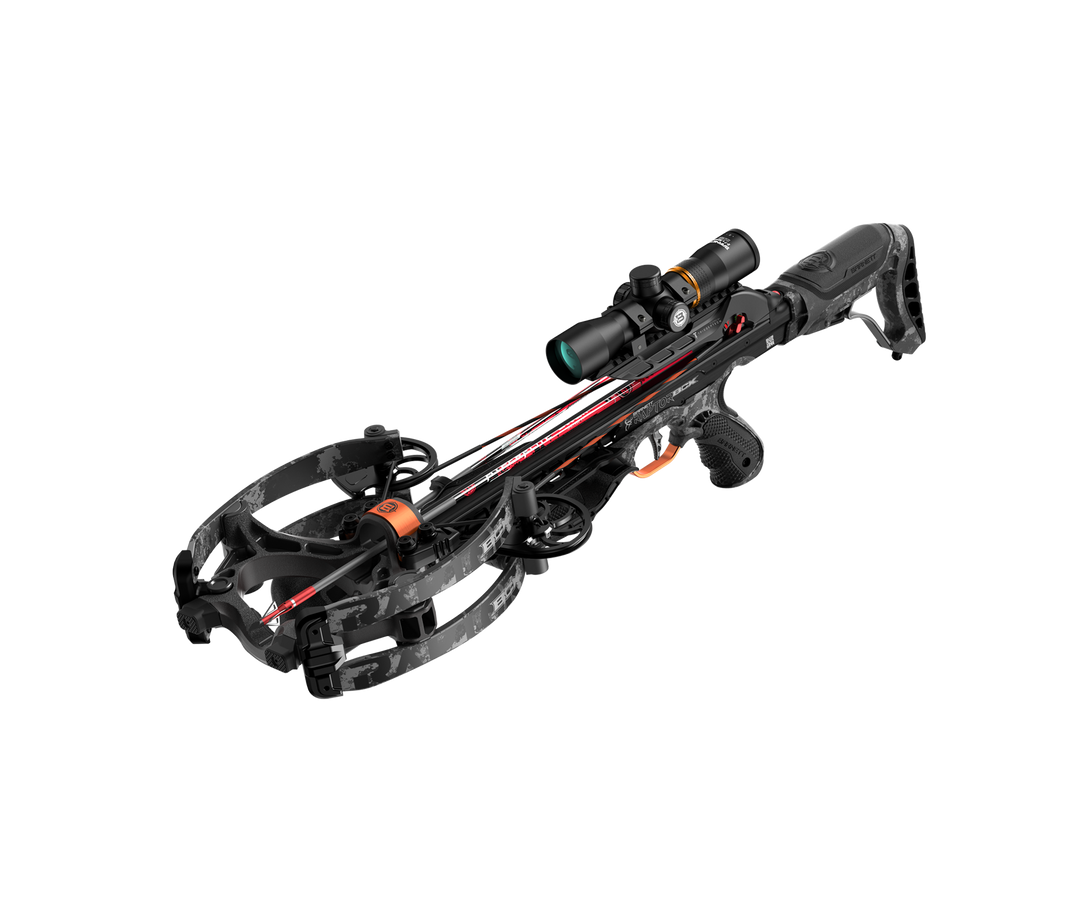
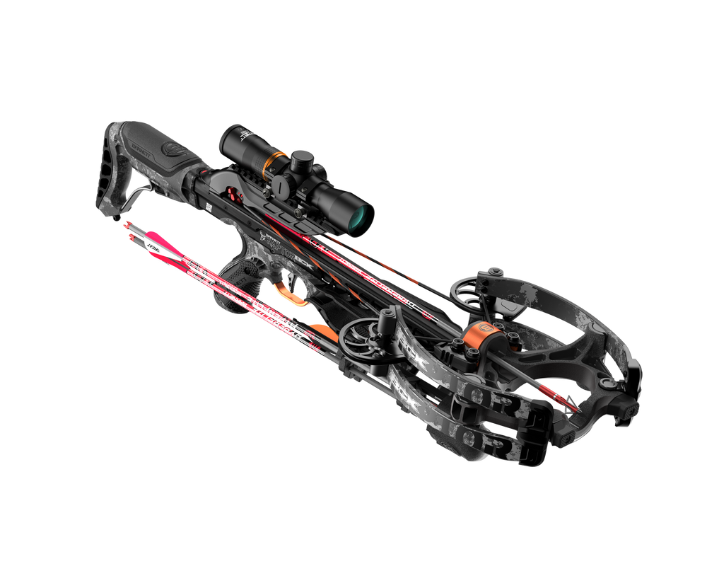
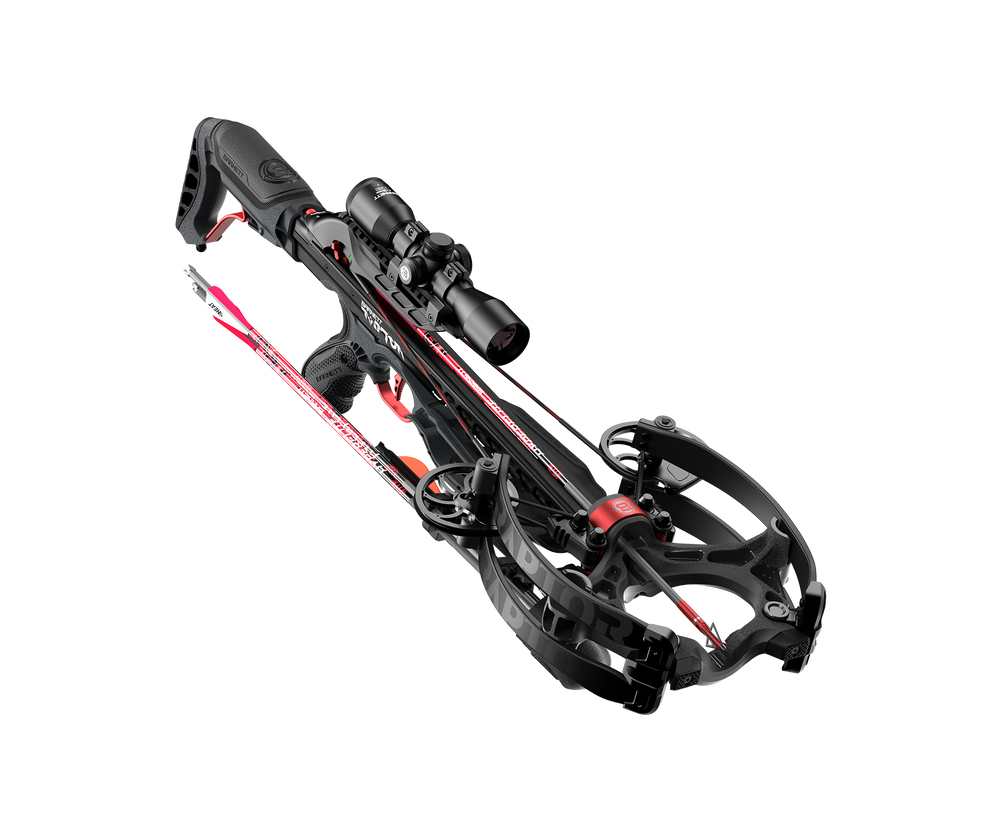
Got the product this morning. Looks great, well engineered & constructed, a piece of art, BUT...
Please do yourself a favor, well actually all your customers, & hire some actual trained graphic designers.
'K?
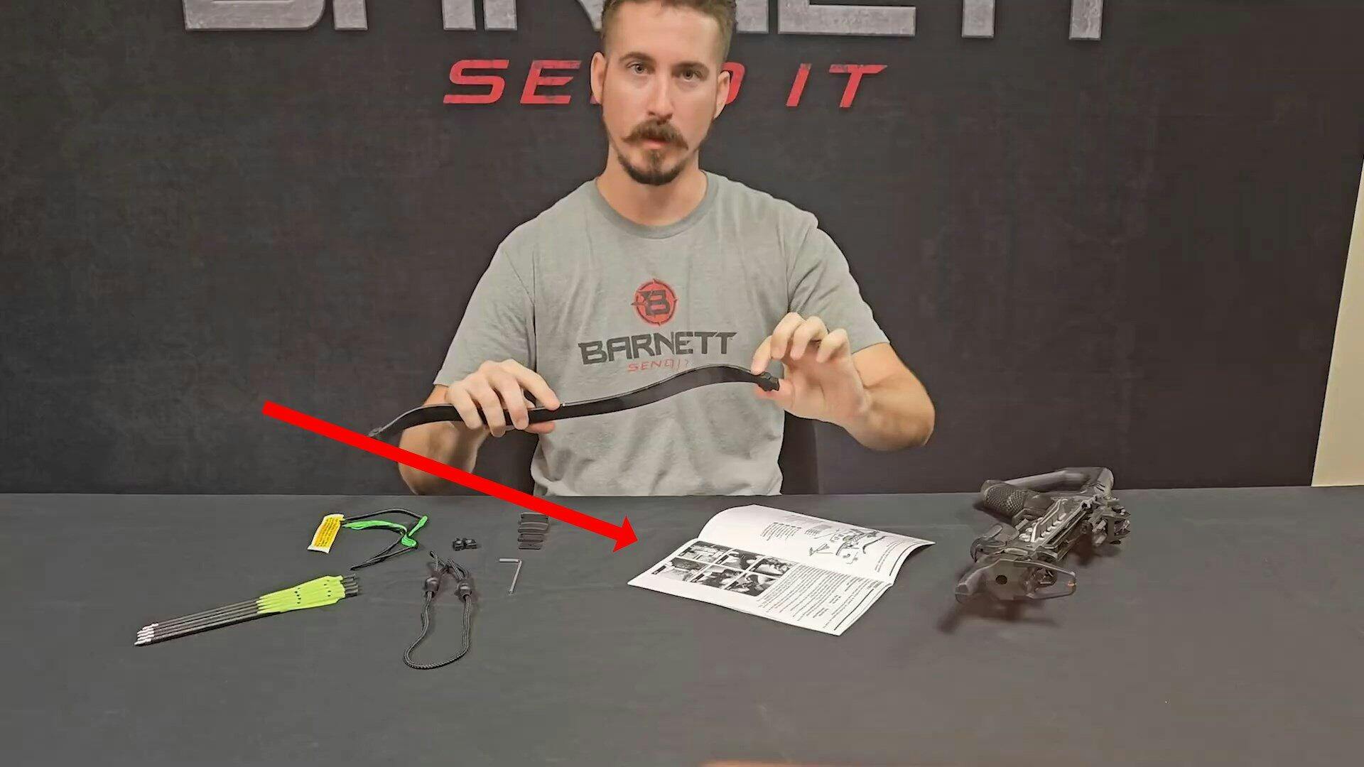
Your Instruction Manual has an expensive, slick & glossy, 4-color cover, but the info really needed is only in B&W, has call-outs that are pale yellow on white on a white background, making them completely ILLEGIBLE.
Particularly when the manual shipped with the product has been so reduced in size, that the font size is 6 pnt or less, making it even more illegible.
Simple, inexpensive fixes. Things that a knowledgeable designer would have pointed out early on.
A manual is available on line in PDF; more bit readable but still in B&W. So for example, you can't easily tell the COLORED crossbow string from the BLACK string assistant cord and the poor photo composition. What am I looking at & from what direction?
Really Basic Stuff.
Fortunately, there are videos:
https://www.youtube.com/watch?v=6YSIdqSfG90
But the manual shown in the vid is at least TWICE the size of the one shipped with the product. Might have helped, but why? Cost savings?